The Enmity of the Maples
There is unrest in the forest
There is trouble with the trees
For the Maples want more sunlight
And the Oaks ignore their pleasThe trouble with the Maples
(And they’re quite convinced they’re right)
They say the Oaks are just too lofty
And they grab up all the light
But the Oaks can’t help their feelings
If they like the way they’re made
And they wonder why the Maples
Can’t be happy in their shade?There is trouble in the forest
And the creatures all have fled
As the Maples scream “Oppression!”
And the Oaks just shake their headsSo the Maples formed a union
And demanded equal rights
“The Oaks are just too greedy
We will make them give us light”
Now there’s no more Oak oppression
For they passed a noble law
And the trees are all kept equal
By hatchet,
Axe,
And saw
I realize I haven’t written here in quite some time. My mother fell really ill late in 2013, and I spent all of last year taking care of her until she passed away two months ago. I didn’t have much free time for painting. Painting this took me nine months. That means I began this before her death, and I’d be lying if I said it was difficult at times to work on this. This painting, however, has been therapeutic in dealing with everything that has happened recently. I am just glad I was able to paint her something before she left me. She enjoyed looking at Post Pluviam and even had me crop it to be used as a home screen image for her phone. My mother never got to see this painting at any stage during its process, and for that I am ashamed. She would have been shocked to see my painting a landscape.
Just as Post Pluviam was for my mother this one is for my close friend Jeff King. Like me he recently purchased a house, and he mentioned he wanted a painting for it. I’ve had an idea to paint a visual interpretation of our favorite band Rush’s masterpiece of a song, The Trees. It seemed like as good of a time as any to finally paint it.
I’ve stated before I don’t much care for painting landscapes not because I necessarily find the subject matter boring but because compositions almost always aren’t interesting enough to make me want to spend a considerable amount of hours at my Wacom tablet prodding away at it. That presented me with a challenge.
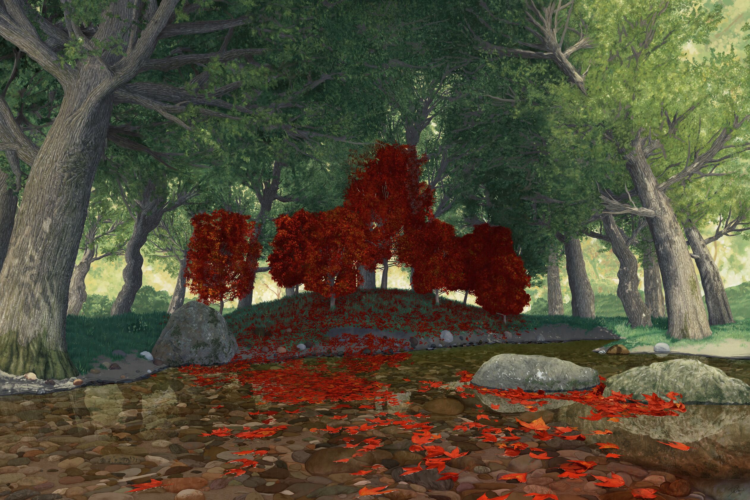
My idea from the beginning was to paint the first half of the song where the Maples were protesting not getting enough light from their Oak neighbors. This meant that the primary subject matter of the painting had to be in shadow — a contrast to conventional wisdom of composition. I also needed to anthropomorphize trees in a realistic painting style. The solution to both problems was to make the maples largely red in a mostly-green environment. This makes the maples stand out more than everything else while still being in shadow. The color and the fact they’re “bleeding” leaves give off the sense that something isn’t right.
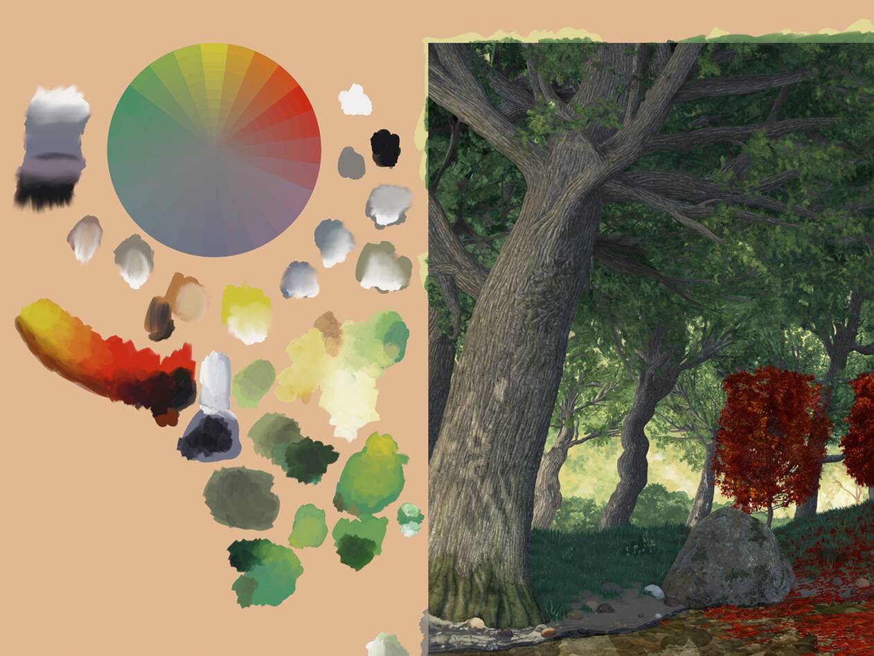
Color Palette & Technique
Another goal with this painting as is with everything I’ve done lately is to push myself as far as I could go. Hemispheres, the album The Trees is a part of, is considered by many to be among the best progressive rock albums in existence. Rush pushed themselves past their limits so much that many tracks on the album were used by many musicians that followed as a guide to hone their own skills. I felt the only way to do The Trees and Hemispheres justice was to simply push myself off that proverbial cliff just as Rush themselves did.

Because I wanted the red of the trees to stand out it is the most saturated color in my limited color gamut. The colors I pick when painting lately — at least with the last couple of paintings — have corresponding tube paints. I used lemon yellow, permanent green light, cobalt turquoise light, ultramarine, and rose tyrien in my color wheel, however all of them are desaturated to varying degrees. The exception was the red, my dominant color. It is instead Canadian red, Pantone 485 C. It was only fitting to use Canada’s red for the dominant color.
In my last painting I limited the color palette by limiting myself to a few different pigments. This time around I limited myself via a gamut mask. Gamut masks can be of any shape but the traditional shape is a triangle of some sort. My mask is a quadrilateral of some kind. Using a gamut mask has a huge advantage in that you end up with a slice of the entire color wheel as if you were a photographer putting a color filter on the camera — except with more precise control.
I used ArtRage again for this painting. Since painting on Post Pluviam ArtRage has addressed many of the problems I expressed in that work’s essay. ArtRage 4.5 is now 64-bit, and it doesn’t want to take over the entire screen anymore. While I find its interface useful the design of it is too distracting at times. It is a joy to paint in. I still use Photoshop for compositing, but the majority of my time is spent in ArtRage these days.
In conclusion I’d like to say this will be printed. It is 36″ × 24″ (91.44 cm × 60.96 cm) and slightly larger in height than my last one so that it fits a standard frame size. This is the most detailed painting I’ve ever done, and it has taken longer than anything I’ve done before. It is indeed like Rush’s Hemispheres in that regard. And, like Rush, I’ll be doing something a lot simpler next time for my Permanent Waves.