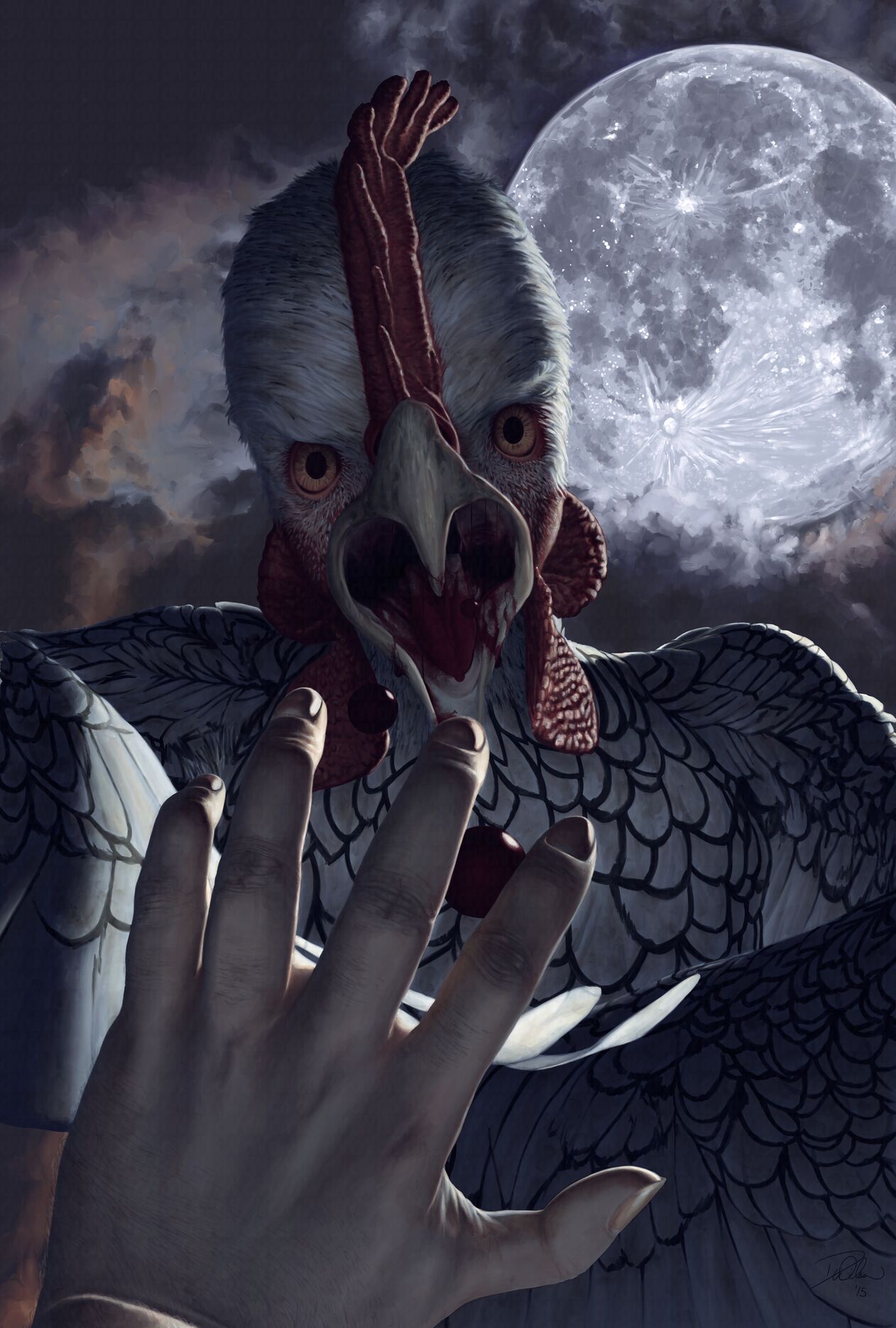
Κοτόπάνθρωπος

Not too alarmed, are you? Good.
This is the shortest interval thus far between posts on this website, the previous one’s being in March. I’ve found myself recently with an abundance of free time as I was laid off suddenly from my position at Opera Software after three years of employment and another two years prior of contract work along with a decade of evangelism before that. Only so much time can be spent sending off resumés and applications. This year hasn’t been a good one for me as I lost my mother in January. That loss compounded with this one has put me in a sort of a funk, and I suppose this illustration reflects my current mood even though that was more of a subconscious effect rather than an intentional one.
The title is indeed Greek… ish. The artwork above depicts a cross between a human and a chicken — a werechicken. Λυκάνθρωπος — or lycanthrope in English — is the combination of λύκος and άνθρωπος which are Greek for wolf and man respectively. Κοτόπουλο is Greek for chicken, so I combined it with άνθρωπος to form κοτόπάνθρωπος (/ko toˈpan θrɔː pɔːs/) — or kotopanthrope (/ko toˈpæn θɹoʊp/).
It’s perhaps puzzling why I chose to use Greek characters in the title to this work. I’ve always been enamored with the Greek alphabet, and seeing as the subject matter of this piece lent itself to a Greek name it seemed fitting. I just find it interesting, that’s all. It also gave me a chance to include some Greek characters I’ve been working on in my font, Ook. I also created some Greek characters that fit within Delicious’ appearance to be used in the title. Delicious is not my font, but I don’t have to modify Jos Buivenga’s typeface to add Greek characters. It’s a separate file and only is downloaded when the language is Greek.
DeviantArt & Conceptualization
About eight months ago I was persuaded to sign up for DeviantArt again for what would end up being my third account there over the years. I don’t know precisely when I first signed up nor do I remember what the account name was I signed up with, but I do know it was somewhere around early 2001 when I was still a senior in high school. I closed that account because of bitterness among the throngs of people on the website then. I signed up a few years later only to discover the same behavior again, prompting me to deactivate my account again. I signed up again and discovered a group of people who have taken me in so to speak. The third time is either a charm or an out as in the old baseball maxim, but I believe the former applies to this circumstance. DeviantArt does have a bad reputation for acidic demeanor among its users. I haven’t yet run into any of the detestable actions I did prior, so I’m giving DeviantArt another time at bat. Three strikes, and you’re out.
The image above is from a conversation during a live art stream I had with some of these people. A discussion began over a werewolf illustration of Tatchit’s. Through either serendipity or misfortune — which depends upon the individual’s opinion — the conversation wound its way to Tatchit’s affinity for chickens and her use of “Sebright” on other websites for her handle. Like the conversation my thoughts wandered and landed upon the idea of a werechicken — specifically Tatchit as a sebright werechicken.
Many of my friends who saw the image before and after I posted it here arrived at the conclusion it was a mutant cucco’s attacking Link from The Legend of Zelda. This never occurred to me, but it fits the image perfectly seeing as if you keep harassing cuccos in the game you soon regret it. I think it’s great when people have different interpretations of my work.
Ever since reading Color and Light’s section on moonlight I’ve wanted to take what I learned from that and apply it to a nighttime painting. Seeing as the lore of the werewolf has the person’s transforming into a anthropomorphized wolf by the light of a full moon I thought I should retain that for the werechicken so it had to be in the picture. In an attempt to make it frightening I wanted to make the werechicken’s looking directly at the viewer. Because the moon needed to be in view the creature needed to be looking downward at its prey. This allowed me to have a bit of fun playing with foreshortening and perspective, especially with the drops of blood’s falling toward the soon-to-be-victim’s hand and face.
The painting is 27″ × 40″ (68.58 cm × 101.6 cm) at a standard poster size and might be offered as a print soon.