Couture Tee Company
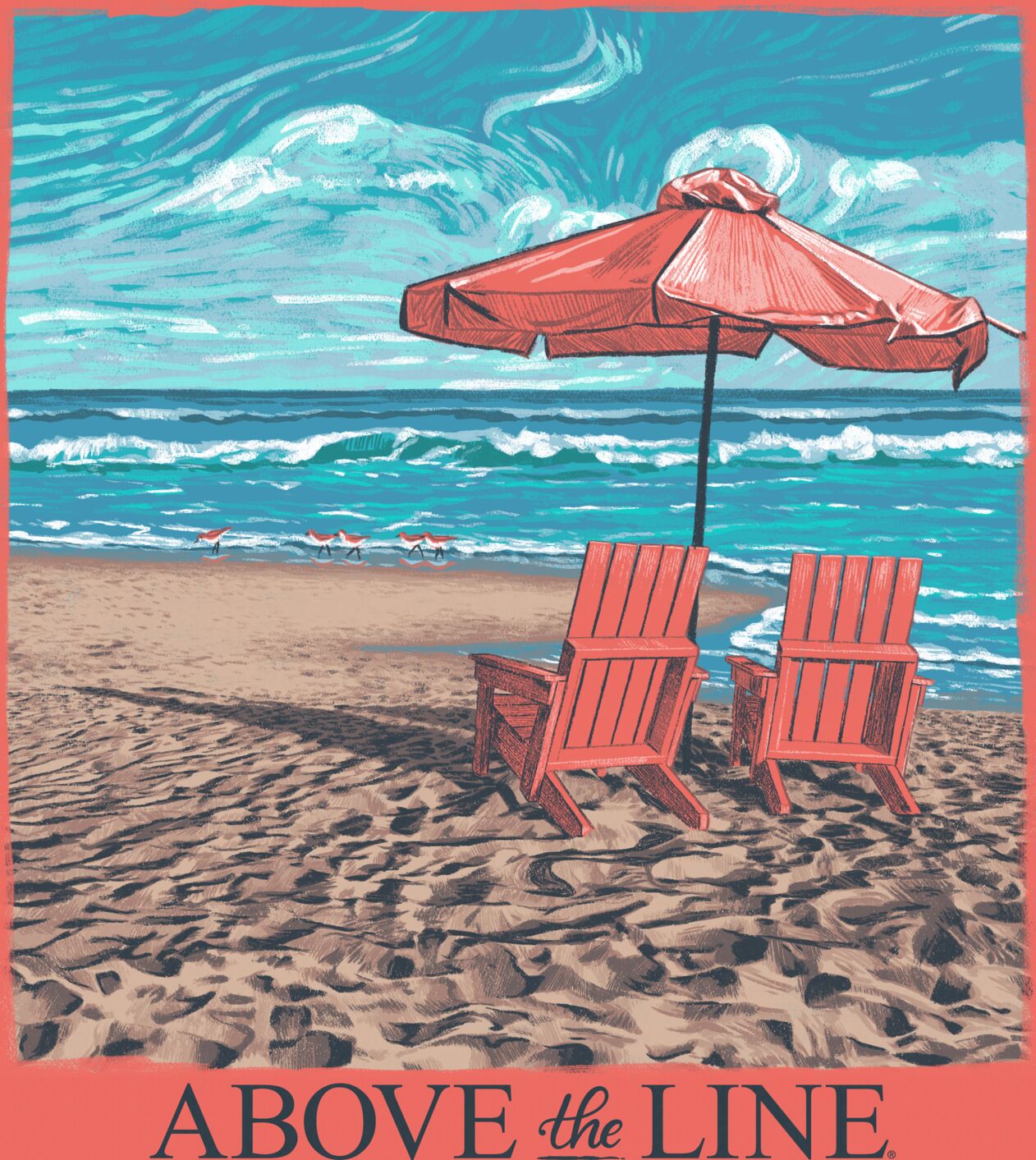
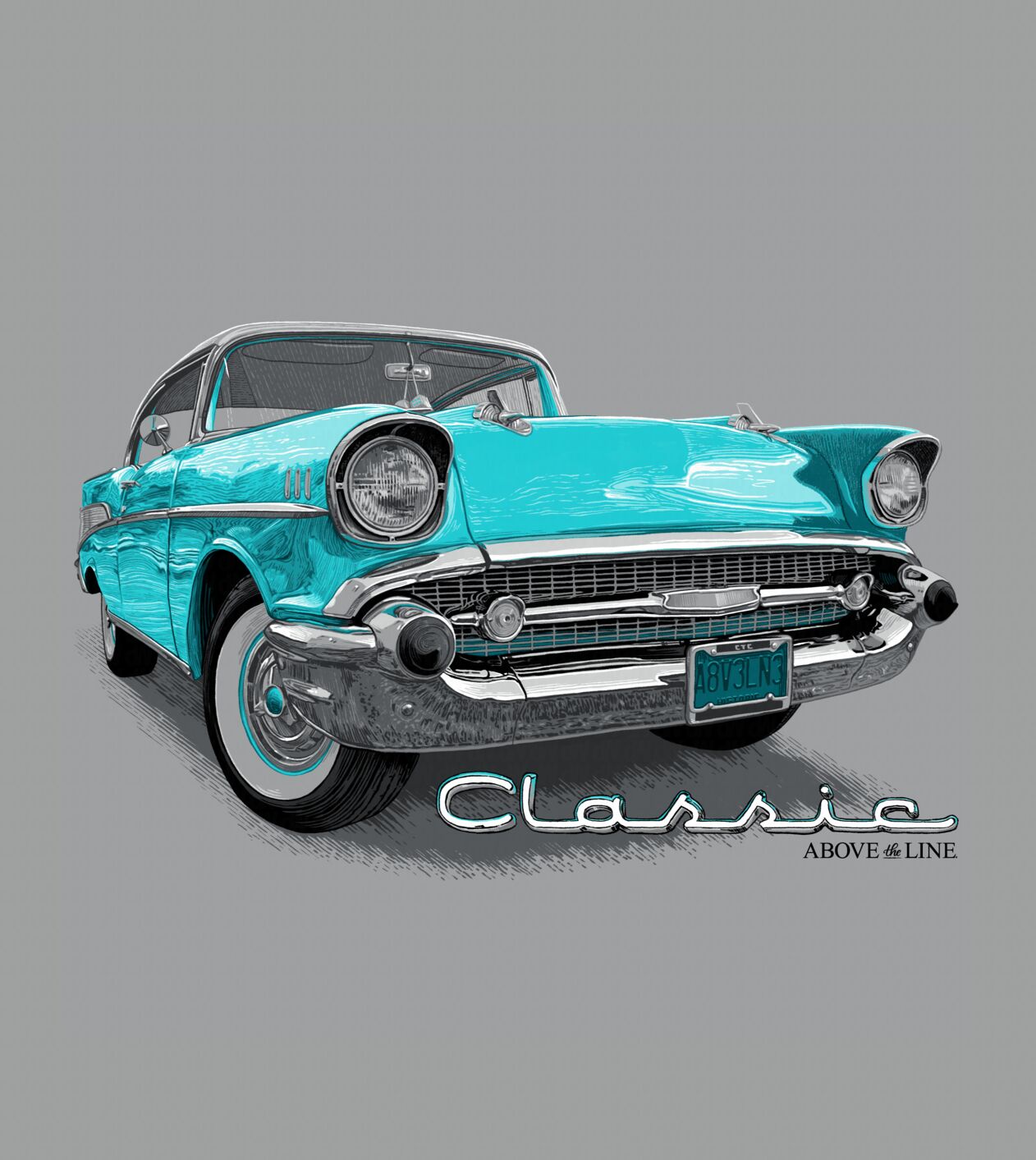
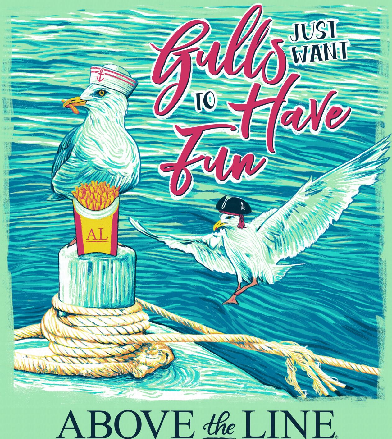
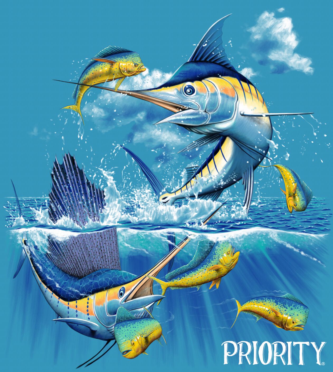
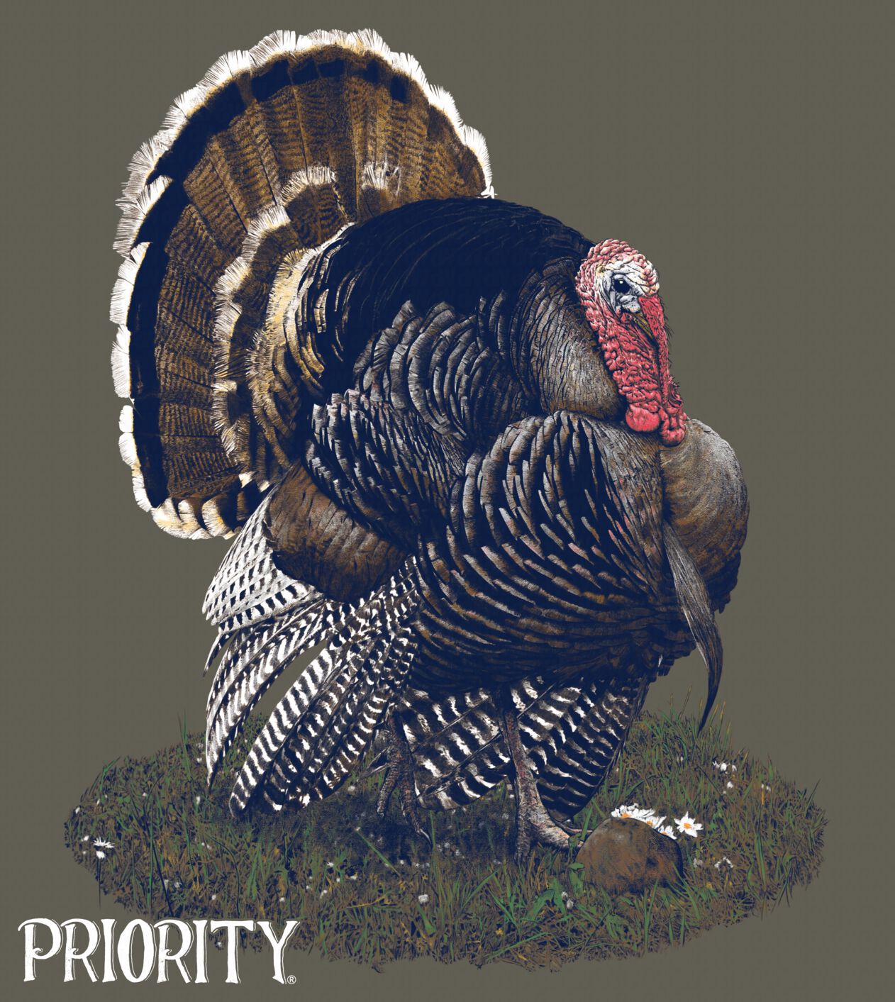
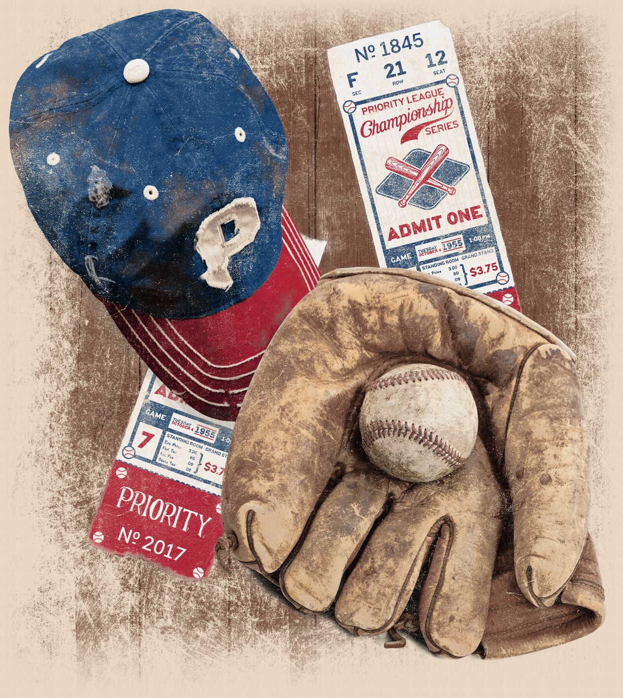
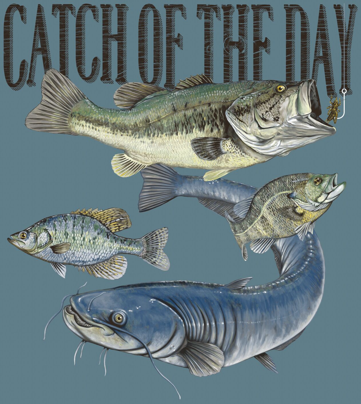
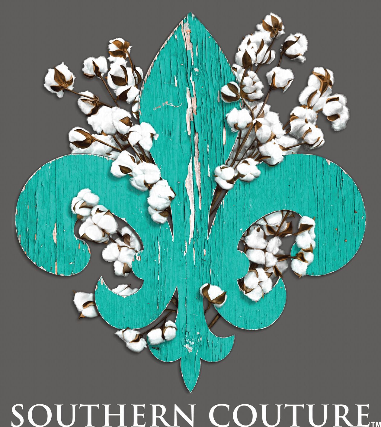
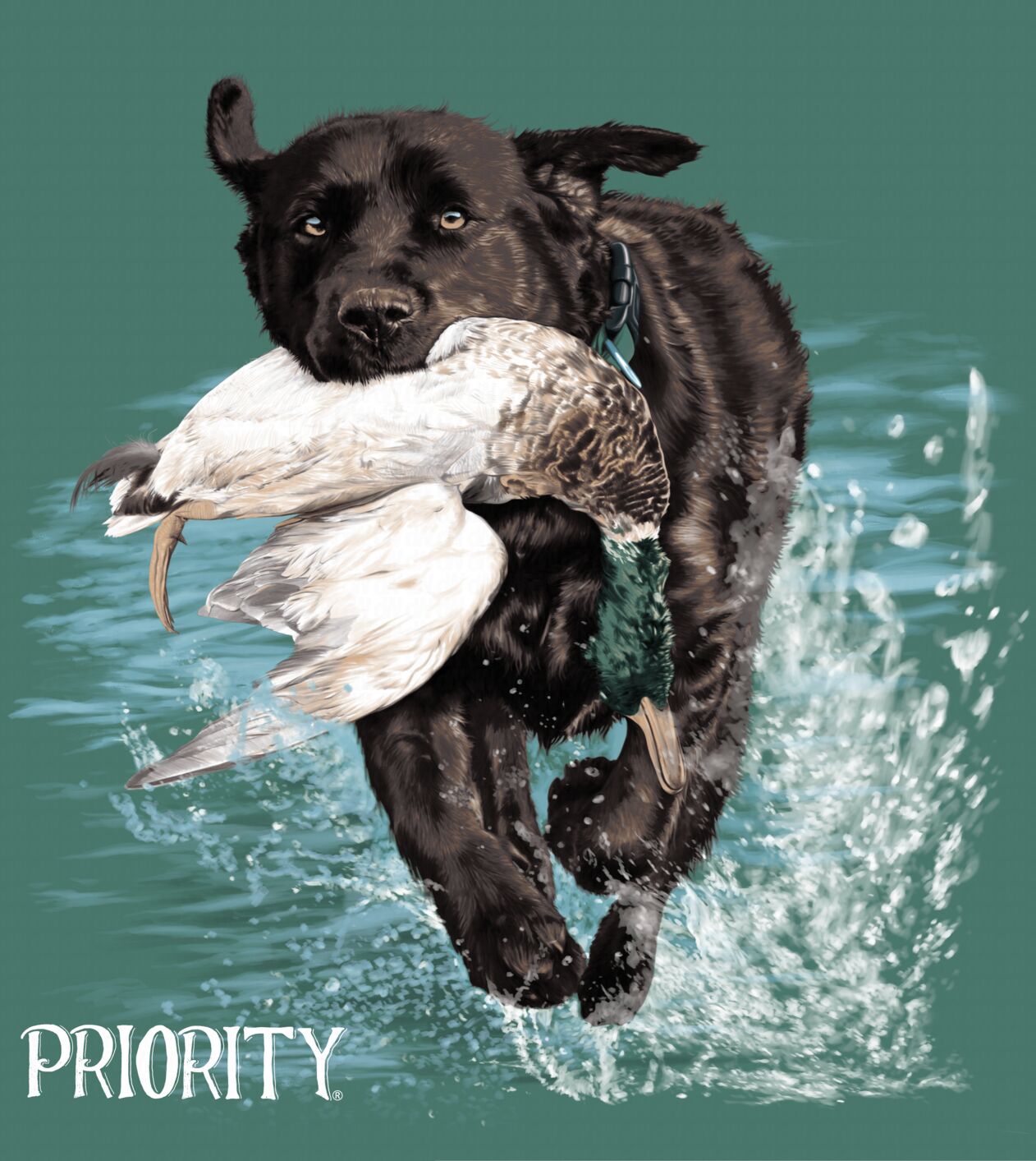
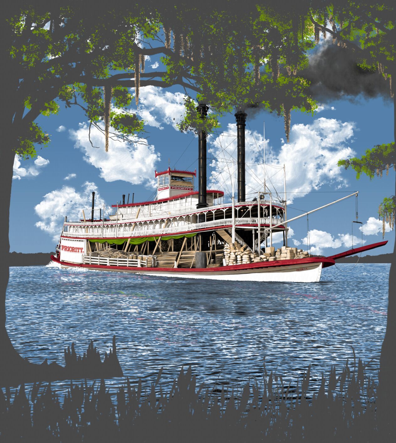
The past few months I’ve been busy on a personal project, but I’ve also been busy on other things, namely working for a new client doing quite a bit of illustration work. While work is ongoing a few of my illustrations printed on t-shirts have been released.
Couture Tee Company sells t-shirts all across the United States but is mostly known around the Southern U.S. with its Southern Couture and Lightheart lines. They are one of the biggest in the country, and they are headquartered in North Louisiana where I live. Most of their products are geared toward a female-oriented market, but they have a male line they are trying to promote now called Priority. Most of the work I’m going to be showing now comes from this line, but I’ve done a fair amount of work for the other two so far. They have new releases periodically around the year, and these have actually been out for a few months now. I plan on showing more here as work I’ve done gets released.
Screen Printing
I grew up with screen printing. My parents in addition to many other things had a screen printing venture they started when I was very little. My brother ended up taking over the screen printing business, and I worked for him for over a decade while doing Web work on the side. I then left to pursue other things. That didn’t last long; my brother passed away last year; and now I’m back to screen printing with someone else. I never thought I’d be doing that again, but here I am.
Illustrating for t-shirts is unique because of the screen printing process itself. Most forms of printing involve four color process printing with CMYK.1 While you can use CMYK when screen printing, screen printing usually does things differently. It is usually used to print on colored garments, and therefore a white must be printed first before printing anything on top of it; that white is what is called a spot color. Typically in conventional offset printing spot colors are only used for effects such as fluorescent colors or metallics and usually never with any sort of halftoning. This isn’t the case with screen printing because every color is chosen based upon the needs of the artwork and not based upon a pre-determined printing process. Most people do not have a clue just how difficult it is to print a t-shirt they buy, especially one with any sort of detailed artwork on it with colors that blend together. A screen is made for each individual color which involves a lot of labor to get the image on the screen, and separating the colors is a manual process because as mentioned before it’s not a pre-determined printing process like CMYK. Computers are only going to get you so far. You must have a firm grasp on color theory along with the behavior of the inks being used. This is why most screen printed artwork is vector because separations can be created simply. For raster images most don’t even try outside of simple things. During the several years I worked for my brother I developed a way to do complex spot color separations even on detailed painted illustrations, provided there’s enough heads on the press for the colors. For the work I do here there is typically no more than seven; the cost goes up the more colors are used.


The Future
I plan on having new regular releases for a while. They give me quite a bit of freedom on many of them, so I’ve even had some opportunities to try out a few things I have not printed before. I’ll be adding more here as new ones are released — hopefully quicker than I did on this initial posting. I also hope to eventually have a crack at their website; it could use some work.
Edits
- Added “Gulls Just Want to Have Fun”, “Classic Car”, “Stay Wild”, and “Tranquil Beach”.
- Added “Steamboat”.
- Added “Dog & Duck”.