Color Modes
The last time I wrote about color I conveyed how we perceive color, the CIE 1931 color space, and about how color temperature works. This time I’m going to continue with the discussion about color and describe how the CIEXYZ color model is transformed into four other color models, the color modes we use on our devices.
RGB
We don’t normally use the CIE 1931 XYZ color space in day-to-day usage. As mentioned in my previous writing on the subject it is used to derive everything else. RGB is what most digital artists will be familiar with. All of our electronic devices use RGB to display images. Each of those devices are manufactured slightly differently and each primary of red, green, and blue will vary. RGB is device dependent, meaning that one red with the same values will not look exactly the same from one device to another without color management of some kind.
In the figure above an RGB color gamut is mapped out on the CIE 1931 color space as a triangle with its points’ corresponding to the primaries of red, green, and blue for that particular color space. There is also a labeled white point for the color of white. In RGB the red primary becomes a tuple of (1, 0, 0) (or (255, 0, 0)), green becomes (0, 1, 0) (or (0, 255, 0)), blue becomes (0, 0, 1) (or (0, 0, 255)), the white point becomes (1, 1, 1) (or (255, 255, 255)), and black becomes (0, 0, 0).
Sorry, your browser appears to be incapable of viewing this 3D content properly. There is a YouTube video available of the content if you are interested.
If you take what was described and graph it out in three dimensions you would get a cube that looks like what is shown above. All colors within that RGB color profile would be on or within that cube. It obviously wouldn’t contain every perceivable color like in the CIE XYZ color space, but it would contain every color achievable by a particular device. That’s essential because designers and illustrators create their work on these devices; we likely aren’t using just one device, and making sure color is exact or similar across multiple devices is important.
The common way of representing a particular RGB channel is a value from 0 to 255. This is because for the longest time the maximum amount of colors possible per channel was 256, or 8-bit. Most displays today can display far more than that. Our eyes can certainly perceive far more than that. This is why options like 16-bit and 32-bit color exist in Photoshop and other programs like it. When possible it’s preferable to use 16-bit color when lots of colors are involved like with photography or painting; gradated areas of color especially end up being better defined.
HSB
Sorry, your browser appears to be incapable of viewing this 3D content properly. There is a YouTube video available of the content if you are interested.
RGB is quite useful, but the values that represent colors aren’t intuitive. (0.18, 0.54, 0.78) is a cerulean blue, but it’s not obvious by looking at the numbers that’s what it is. Many artists when trained traditionally are shown a color wheel and learn to mix colors using hue, saturation, and brightness. Even people who aren’t trained see color in this manner as well; it seems to be a rather intuitive way for us to think about color. There is a reason for that but more on that later. When we look at a blue we determine how blue it is (hue), how vibrant it is (saturation), and then how light or dark it is (brightness)2. HSB (or HSV) is a method to map RGB to this manner of thinking about color. Hue is represented by an arc degree from 0 to 360 where 0 and 360 are red and 359 is a red with a very faint magenta hue with everything else in between; saturation and brightness are represented as percentages which of course range from 0 to 100.
Like with RGB this can be graphed in three dimensions. As mentioned hue is represented in 360 degrees which makes it able to be represented as a circle. Saturation can be represented by having that circle gradate from white in the center to fully saturated colors on the end. Lightness can be represented by making all colors represented in the circle gradate down to a single black point. This creates a cone shape. Alternatively, if representing just hue and saturation as a 2D graph the result would be just a circle — a color wheel similar to one many artists are already familiar with.
One downside to HSB is that because it is a distortion of the RGB color model it can’t represent every color in an RGB color profile; there are some gaps. This is evident from playing around with Photoshop’s color picker and watching changes between values. However, it is used to pick colors and not to display them.
CMYK
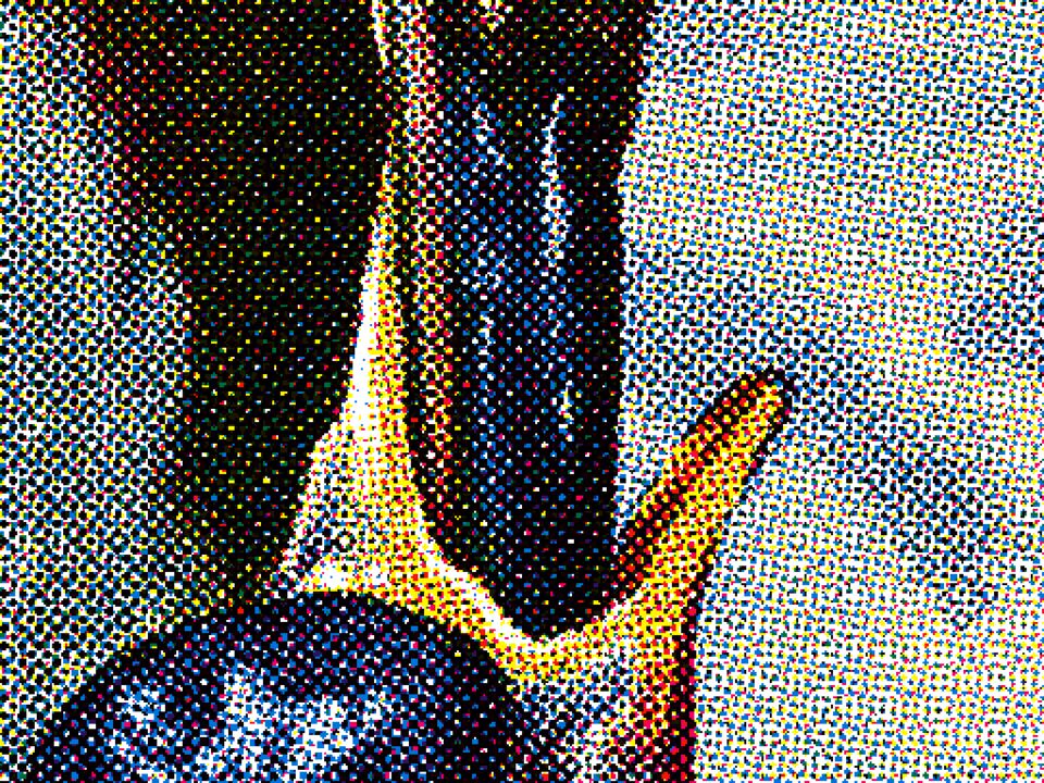
CMYK is different from RGB and HSB. RGB derives its color from the additive mixture of light where white is the existence of all primaries while black is the absence. CMYK is the opposite; existence of all primaries is black while the absence is white. RGB is used for our displays, CMYK is used for our printing needs. Like RGB it is also device-dependent in that every ink manufacturer and printer will have slightly different colors and therefore different color profiles. RGB is to be used in digital media while CMYK is entirely analog using pigments printed on a white surface such as paper using four inks — cyan, magenta, yellow, and key (or black).
You can’t just print solid blocks of ink and expect them to mix, so to solve this arrays of dots at slightly different angles called halftones are used to juxtapose primaries together to “mix” colors. This is very similar to how a computer display uses subpixels of red, green, and blue at different brightnesses to form individual pixels. Just like with subpixels if they’re small enough the eye is incapable of distinguishing each of the halftone dots; most professionals consider 300 l.p.i. (118 l.p.cm) to be this threshold.


CMYK isn’t capable of producing the entire gamut the human eye can perceive. It is even incapable of producing colors as vivid as most RGB gamuts. So, when we use our computers and convert RGB images to CMYK the vividness of the colors are often lost as shown above. I mentioned above RGB is what our computer displays use. How can your computer display show CMYK images, then? It can’t. CMYK color on a computer display is nothing more than a simulation. The image is still being shown to you in RGB. Colors are just being calculated differently within the graphics application. It cannot accurately show you what a print will look like, and under most circumstances it should never be used except to convert for output on a printer. This means it shouldn’t be used as a working color profile; it’s ridiculous to do so. When producing work for print should you be mindful of color shift? Of course, but always prefer a printed proof over a simulated CMYK image on an RGB color screen.


The figure above showcases as best as possible the differences between a CMYK image on the screen and the result of a professionally printed work. The printed work is shown to have slightly more vivid colors despite being printed using the CMYK image. The vividness of a printed red is especially difficult to simulate on a computer, and often when a bright CMYK red looks dull on a computer screen it’s quite vivid when seen on paper.
L*a*b*
In 1976 the CIE reached an agreement on another color space — CIELAB. Anyone using Photoshop should remember seeing this in the color picker, but many don’t know what it is used for. The L*a*b* color space is a lot like the CIEXYZ color space explained and shown in Color in that it includes all colors perceivable by the human eye. Why have it if CIEXYZ also contains all perceivable colors?
Before the CIE met to agree upon the CIE 1931 standard there were numerous theories on colorimetry — the science of human color perception — and attempts to graph out a color space. Most early color ordering systems dating back to the 18th century tried to map out every possible color into some sort of 3D object. None of these systems were remotely accurate. This changed with the introduction of the Munsell Color System by Albert Munsell in the early 20th century. Munsell’s realization that these models couldn’t be made to represent color accurately led to the CIE’s eventual standardization of a color space which could. In the 1940s the Optical Society of America took Munsell’s work and improved upon it greatly by painstakingly measuring human responses to color; this led to a color system where changes in color were perceptively uniform. This means that if you take a color which is blue-green and another which is red-orange and change their values by the same amount the visual change would appear homogenous. This is where CIEXYZ falls short. There simply wasn’t a perceived need to have changes in color be uniform until the improvements to the Munsell Color System a decade later.
L*a*b* came about in 1948 from a desire to have the OSA’s results on color perception be applied to the CIE’s color space, and in 1976 the CIE made improvements and standardized it into CIELAB. L in L*a*b* represents lightness, a represents the magenta/green opponent colors, and b represents the yellow/blue opponent colors. In Color I mentioned we do not see in red, green, and blue channels but didn’t go into detail of how we see. Our brains process the lightness of a color separately from its hue; this is largely why HSB is more intuitive to use than RGB for us when picking colors. However, L*a*b* fits far more closely to how we actually see and process color in our brain.
What exactly does all of this have to do with digitally painting or designing? It is useful when wanting to do adjustments to color in photographs or artwork because the color can be adjusted independently of its lightness, unlike with RGB.

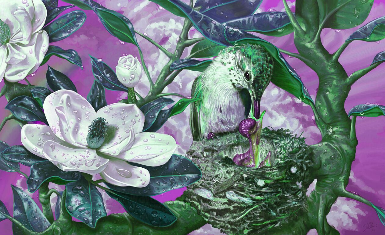

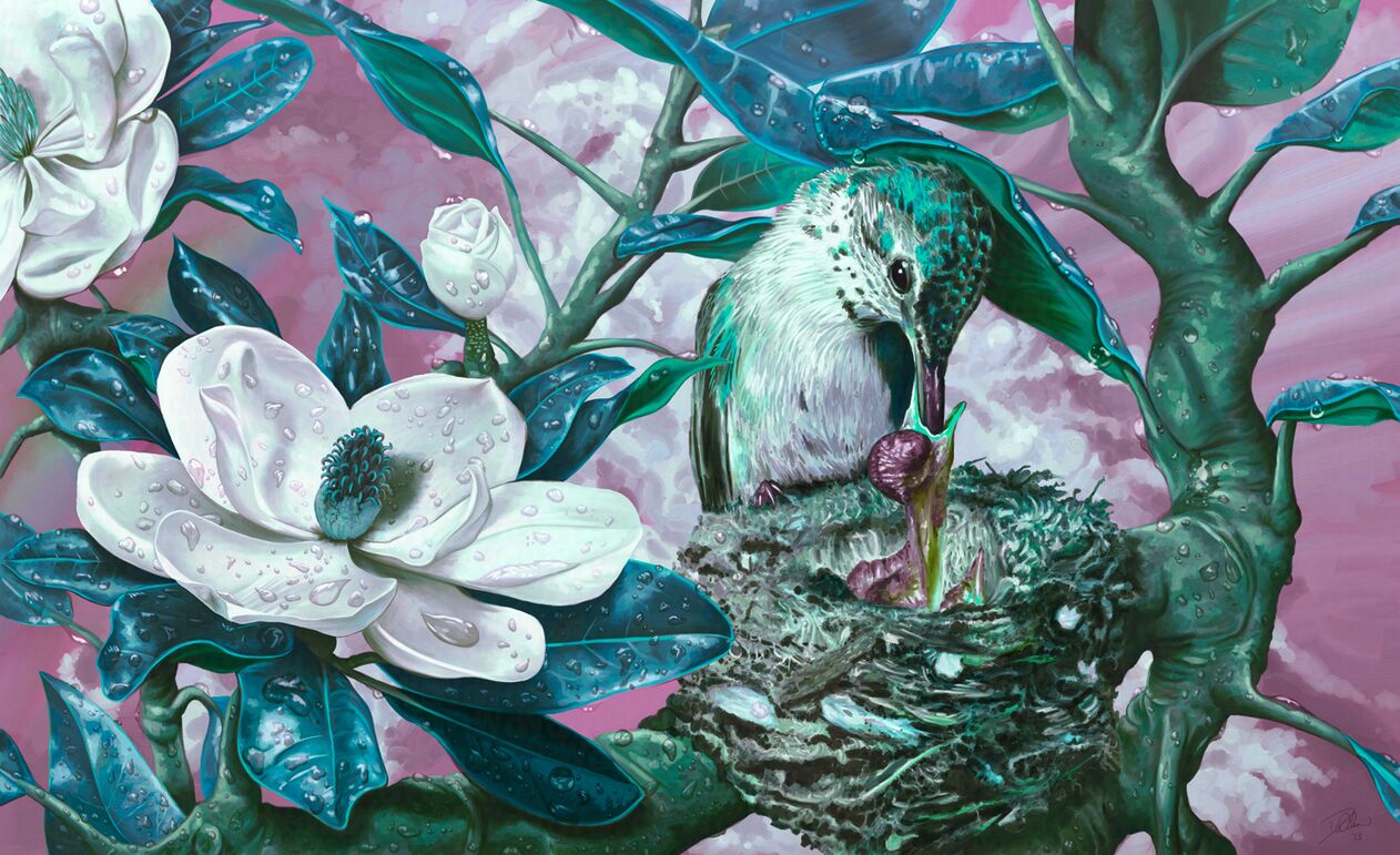
When looking at the images above it is easy to notice which has the colors adjusted the best. The image that was adjusted while in RGB mode has colors which aren’t remotely similar in value and brightness to the original while the image that was adjusted while in L*a*b* mode maintains consistent value and brightness to the original while the hue is changed significantly as intended. L*a*b* is a better choice for adjustments like this because the colors can be more accurately calculated.
That is not all L*a*b* is good for; L*a*b* is what is used as an intermediary when converting between color models such as RGB and CMYK. To convert between models the colors of the image must be first converted to a color space and then converted to the target model. Just remember what Boromir said in The Fellowship of the Ring, “One does not simply convert from RGB to CMYK.”
Color management, color profiles, and exactly what is involved with converting between color models is for the next part of this series on color.