Ook.
NOTICE: If things this page describes does not correspond to what you are seeing it is because this post is referencing a previous version of this website.
It’s long been time for a change around here. The last thing I penned in the previous incarnation of this weblog was on . The preceding post was made on — quite a while ago. I simply lost interest and honestly didn’t have the leisure time for it.
The past two years have brought forth copious changes in my life, and the brief leisure time I’ve had was first spent designing by freelance and later spending time on random personal projects of mine. It’s high time I allocated some of my time to illustrating again as my last major piece was completed in August of 2010.
The primary focus of the old weblog was obviously Web technology, and I’ve grown to find the topic tiresome to write about. I obviously love the Web because if I didn’t I wouldn’t have spent the time programming what’s seen here today. It’s just a topic so many write about, and there are far more people out there more qualified and better at writing it than I am. The most fun I’ve experienced when composing blog posts was when I was writing about my own artwork or design work, and with this new weblog I shall.
Ook
Yeah, I just wrote the title of the post again as a subhead sans punctuation, but there’s some logic buried in the insanity. It’s the name of the body copy font that was downloaded and most likely visible at the moment.
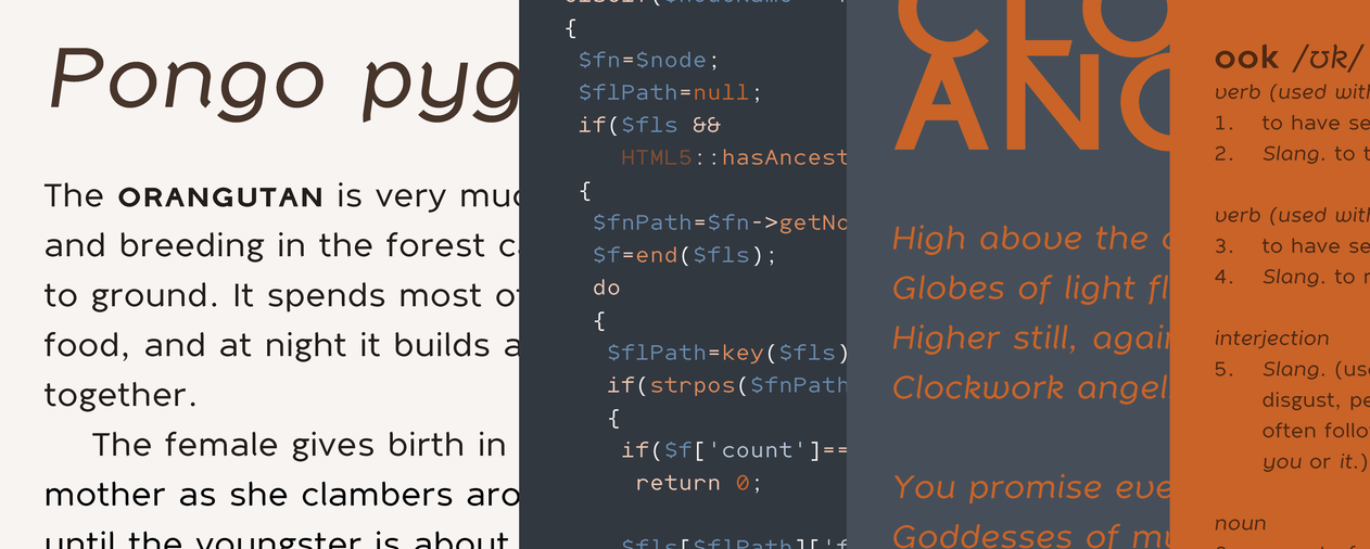
This typeface was one of those “random personal projects”. The motivation for creating a font was because I wanted a font I could experiment with on my own without having to obtain permission from someone else to do it. Many modern browsers are capable of displaying advanced typography such as ligatures, small caps, tabular figures, old-style figures, and even superscript and subscript. Most fonts out there don’t even contain these features because most commercial software have absolutely no support for them, so what’s the point? Fonts with support for these things have typically been considered pro fonts to be used with professional software and are often priced accordingly. With Web browsers’ stepping up their game with support for these features perhaps there will be more fonts out there with these capabilities.
In the meantime I took the time to include support for them in Ook. I’m not a professional type designer, and this is my first typeface. The design is rather geometric, but there’s some playful humanist qualities to the characters. It has a rather tall x-height, and that is because it is meant to be used in body copy at smaller point sizes. However, because of the care I took into giving the letters some character the typeface’s design doesn’t fall apart like many screen fonts do when zoomed in or when viewed with high pixel density devices.
I’m not being arrogant in thinking I’m as good a designer as a professional type designer… because I’m not. The fonts are intended to be experimental, and they will remain so. I simply designed a typeface using the knowledge I have and what I read up on while designing it. I learned quite a lot in the process of designing Ook, and I hope to learn more in the future.
The fonts are free, and they’re released under a Creative Commons Attribution-NonCommercial 3.0 Unported License. My additional rules for remixing and for attribution are fair:
- If the work is changed in any way it cannot henceforth be named Ook.
- All copies or derivatives must be attributed to me. All derivatives must be labeled as a derivative of Ook.
- When used on the Web attribution for Ook must be made either on the webpage by which it is used or within the style sheet in which it is defined with a Web address back to this page.
Like I said I believe that is more than fair. I doubt any sane person would want to name a typeface Ook anyway. I intend on making improvements over time to the fonts, so the design isn’t even carved in stone or cut out of lead as they used to be. Having multiple forks of the same font with the same name would be madness.
Design & Layout
I still use Delicious as my logo and header typeface. In retrospect, I believe — ironically enough — it was Jos Buivenga’s first typeface design, so I’m using a combination of my first design with his. I’ve always adored his typeface design work ever since I stumbled upon his website. I’ve bought several of his fonts because they’re quite affordable and well made.
Since I’ve spent a lot of time describing two typefaces it’s safe to say the design of the website as a whole is typographic in nature. It is designed using the golden mean scale, and most things on the page within reason are scaled and designed with it in mind. The colors are rather simple, but from first glance one might think it’s largely greyscale but the page color and text colors are bluish in tint.
Everything is laid out with one thing especially in mind: to be able to view large images without breaking flow. The major point of the website is to showcase images. Technologically I use JavaScript as best I can to determine the viewer’s connection speed and provide them with an image that’s based upon that speed, their device screen size, and the pixel depth of the device. It’s not a perfect system since the browser should be handling this itself, but it will work as a crutch until browsers begin support for some form of responsive image mechanism. If JavaScript isn’t supported or turned on a default image is displayed instead. Because of this the images can get quite large, and I’m not afraid of showing them to devices and browsers which can view them despite what limitations my own web hosting company places upon my bandwidth.
The blog is programmed responsively, and because the layout is so simple not much is changed in the layout on a small screen to a big one. One of the most annoying things about responsive design is that today it’s a new toy, and it is overused so much to the point that people today can’t resize their browser windows on a desktop computer without having the layout change drastically and lose their location in the document in the process. I did my best to avoid that as much as possible.
There’s much more to describe about the technology surrounding this weblog, and a summary of what I did can be found in the about page.
I believe I’ve stated just about everything I wanted to say about my new endeavor here, so… Onward!