Color Profiles
It has been a while since I touched upon this topic of color where I wrote about each of the color modes and models. While the title of this essay is Color Profiles color spaces are to be the focus. This is intentional. ICC color profiles are the files you interact with while color spaces are what the information within the files specify. I chose to use “profiles” in the title because profiles are what will be used. Since I’m describing the color spaces themselves I’ll refer to them as color spaces from here on out except when referring to interacting with color files.
Color spaces represent a device’s specific color capabilities of a color model, allowing for precise reproductions of color. I have actually mentioned a color space already when detailing the CIE 1931 XYZ color space. The CIE 1931 XYZ color space is a mapping — an identification — of the CIEXYZ color model. The CIE 1931 RGB color space shown then is of the RGB color model. There’s only really one CIEXYZ and CIELAB color space because their purpose is to encompass the entirety of human vision, but there are thousands of RGB and CMYK color spaces because of the need for one for every device, printer, and paper type. Because of this reality and the fact I’ve discussed CIEXYZ and CIELAB to death already I’m going to just focus on general RGB and CMYK color spaces.
RGB
There are four color spaces that are the most commonly experienced: ProPhoto RGB, Adobe RGB (1998), sRGB, and SWOP CMYK. These are general, standardized color spaces intended for different purposes.
SWOP CMYK
As we Web-heads learned during the fight for Web standards it is a good idea to have standards to go by so different vendors do not have differing and incompatible technologies. This happened in the past with printing. Just like with HTML and CSS it’s incredibly important to standardize colors of inks and how they are supposed to behave on different materials. Many printers across the United States in the 1960’s were moving from the old letterpress printers to offset printers. There were absolutely no standards, and it was impossible for someone to provide an image to be printed and have it look correct on different materials and even between different shops. In the mid 1970’s SWOP was born from that need, and shops across the United States and Canada standardized on it. However, as the rest of the world transitioned they created their own standards. Fogra in Europe developed their own standard in the early 1980’s which later was adopted as the ISO standard because, well, ISO is in Europe. Japan has their own, and so forth. Most printers around the world have since adopted the ISO standard.
So, why am I mentioning SWOP when the ISO standard based on Fogra is used more? It is because SWOP is Photoshop’s and many other programs’ default CMYK profile. SWOP’s gamut above is a generalization as it varies based upon printing process and material. It’s also a good generalization for the ISO standard as well. When sending digital files to a printer — digital or analog — the files should be converted to a CMYK profile before output. But, wait, didn’t I say and explain why in Color Modes that it was almost always stupid to work in CMYK on a computer because it was only ever a simulation? Converting before output is different than actively working in CMYK. Unlike the other color spaces you probably will never and should never use this color space. The first reason for this is because Photoshop uses at the time of this writing 16 year old SWOP color profiles when newer ones exist and are free for the public to use. The second reason is because different printers have slightly different color profiles for itself and for each kind of material to be printed on despite following a standard, and those profiles should be used instead of a generic standard as they are specifically calibrated for the task at hand.
sRGB
Just as SWOP is Photoshop’s default CMYK color profile sRGB is its default RGB profile. sRGB was developed in 1996 by HP and Microsoft to create a standard all RGB devices could go by. It’s been accepted by numerous companies, and it is the most widely used color space/profile in use today. It is also the default color space for the Web, so when outputting to the Web adherence to this color profile is necessary unless you wish to embed another color profile in the image.
The sRGB color space isn’t a good working space unless you intend to output just on the Web or for general computer consumption. sRGB is designed as a lowest common denominator for displays and is a color space any display should be able to show. As can be seen in the figure earlier there are areas of the generalized SWOP color gamut that are outside the sRGB one. You’re seeing that correctly; there are colors that can be expressed in CMYK that cannot be expressed in the standard RGB color space. This is problematic as really bright cyans, teals, and yellows will not be possible when printing; they will be clipped before conversion to CMYK even happens. The solution to this problem is to use the next color space.
Adobe RGB (1998)
Adobe in 1998 with the release of Photoshop 5.0 added in color management. The history of this color space is rather interesting in that it’s actually a mistake. Thomas Knoll, the lead developer of Photoshop, wanted to have a profile built in which implemented the SMPTE standard used in motion pictures, but the idealized color primaries were used instead of ones actually in the standard. However, users loved the new profile because the primaries allowed for the general CMYK gamut to be almost entirely encapsulated in an RGB color space, meaning the problem outlined earlier where large amounts of colors in the general CMYK gamut exist outside the RGB color profile was solved. Adobe chose to keep it.
This is the working color profile which should be considered when printing is intended or might be a possibility in the future. The sRGB gamut is just too small for these purposes. sRGB has another shortcoming: there are not enough colors in the gamut to express high channel bit depths such as 16 or 32 bits per channel. Adobe RGB has the same problem to a lesser extent; it is perfect for 16-bit but really not ideal for 32-bit channels. The next color space is good for all of that, though.
ProPhoto RGB
The ProPhoto RGB color space was developed by Kodak around the same time as Adobe RGB. During this time there was quite a bit of disruption as digital cameras were starting to become affordable, and the rate of growth was so large it was easy to see a time where film didn’t matter in the development of photography. Photography historically has been limited by the gamut capabilities of the film used. This wasn’t going to be the case, and colors possible in an image could be the entirety of what the camera’s sensor could pick up. Just like with printing and computer displays cameras have since standardized on this color space, and just like with printers and displays variants within this make it preferable to use profiles specific to the device. And just how the printing surface can affect the color profile with CMYK the lighting conditions can affect the color profile of a camera. ProPhoto is a generalized color space.
High-dynamic-range photography has historically been an extremely difficult process, but today it’s a lot easier. Many cameras make it possible with just a simple tap of a button. By compositing multiple exposures it’s possible to get an incredibly large range of colors. It’s imperative to work with 32-bit channels when handling HDR photographs. ProPhoto’s incredibly large color gamut allows for these colors to be represented digitally.
When viewing the figure above there is something peculiar about ProPhoto RGB. The green and blue primaries are off the spectrum of human vision. It’s not an error. Because of RGB’s limitations2 and to get the extra colors necessary for high quality photography the primaries needed to be off the scale. This means that a small portion of the ProPhoto RGB color space are what are called impossible colors; we cannot see them. However, they are absolutely necessary for calculating colors in the space which we can see.
If this color profile contains most of what is possible with RGB then why shouldn’t it be used instead of Adobe RGB? It depends on your source material. If handling HDR photography then ProPhoto is the better choice, but if designing or painting then Adobe RGB likely will contain far more colors than capable of being used. A general rule of thumb is to use a color profile that contains more colors than necessary to output; an image with a higher gamut color profile can be converted to a lower gamut profile.
Adobe’s Color Settings Dialog
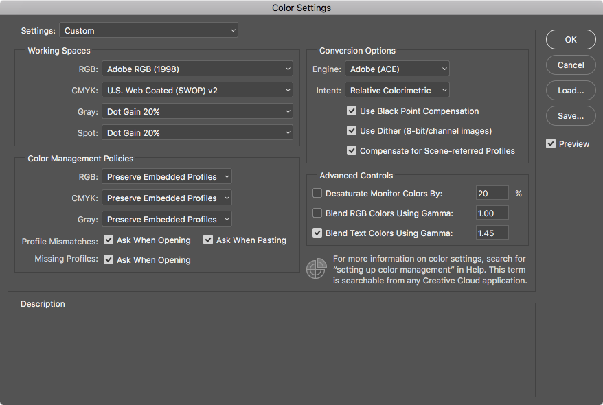
Before I move on to other topics I feel like I need to discuss Adobe’s Color Settings dialog. This one is from Adobe Photoshop, but it applies to their entire suite of applications. Select the color profile that most closely fits what you will mostly be doing. If you do mostly Web work then the default sRGB is fine. Do yourself a favor and check everything under Profile Mismatches and Missing Profiles. Yes, you will get a dialog every time you open an image about its color profile if it doesn’t match the working profile, but you’ll be notified immediately and be able to convert if necessary before spending hours working on something with the wrong color profile. Okay. Onward!
Display Profiles
Not only are there more general RGB and CMYK profiles there are multitudes of color profiles for every display and every printer. I’ve already mentioned that if a color profile for the printer exists then use it instead of the generic SWOP profile as it would present more accurate previews. There are also RGB profiles for device displays, and these are extremely important as they show what colors the display itself is capable of exhibiting, and the display is how we see at we are working on.
I’ve already mentioned that sRGB was developed to be a baseline standard color space for devices. Mostly all displays will be able to display the entirety of that gamut. Still to this day it is the lowest supported color space even after 20 years of technological advancement. Artists and designers should never skimp on their display. Commodity displays will be able to do sRGB, but Adobe RGB and especially ProPhoto is completely out of the question with cheap displays. If wanting accurate color output money will have to be parted with. There is a near direct correlation between the cost of a display and how many colors it can output. A good display can easily cost more than the rest of the device it is interfaced with and is entirely worth it if you value accurate color output. Display technology has made leaps and bounds since 1996 when sRGB was created, and many companies are starting to put wide gamut displays into their devices. Apple has a long history of valuing good color output as their displays have been a safe if expensive-even-for-high-color-gamut buy as they could for at least 15 years now display better than sRGB. As Apple and others put better and better color output into their devices aimed toward the general public sRGB becomes more and more of a hinderance than anything, causing some to call for a new baseline color profile to be created.
Color Calibration
As complicated as all this is it gets even more intricate. Each device will have their own color profile supplied by the manufacturer, but there are still variances in manufacturing involved which cause the actual used device to have a slight deviation in output from the manufacturer’s color profile. Environment also plays a role in color perception as described already in Color. A room with bright fluorescent lights will make colors appear differently than a room lit by incandescent light or not lit at all; this needs to be taken into account in the color profile used by a display just like it would if painting with traditional media. What do we have to solve these issues? Color calibration.3
For years the only game in town for calibrating on a personal computer was Apple’s ColorSync which has been available to every Macintosh user since 1993. Windows didn’t support color calibration at all until early 2007 with Windows Vista. Color calibration is rather hit and miss on Linux and is only really a recent endeavor there, only coming about within the last 5-6 years. However, like a lot of things with Linux if you can get it to work in the first place it usually works well afterwards.
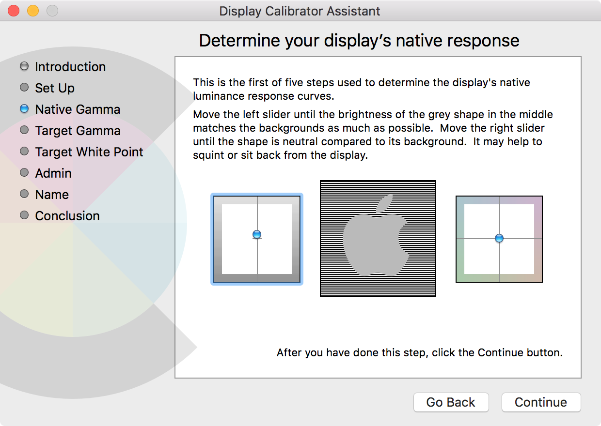
There are two ways to calibrate displays: manually through the OS’s built-in dialog or through a calibration device. “Manual” calibration in macOS can be found in System Preferences by going to the Displays preference pane and then to the Color tab. Apple in their infinite wisdom has made this more difficult for people in Sierra, so if you actually want to calibrate your display you must press option and click the calibrate button to get options to do so. On Windows you go to the Control Panel and then to Color Management, and clicking the Calibrate button under the Advanced tab will bring up the calibrating tool. Finding it on Linux varies with the distribution. Neither iOS nor Android natively support color calibration. Color management is supported internally within iOS as it uses the same ColorSync software as macOS uses for color profiles in images, but for some reason that’s beyond me they’re not allowing color calibration for the display itself.
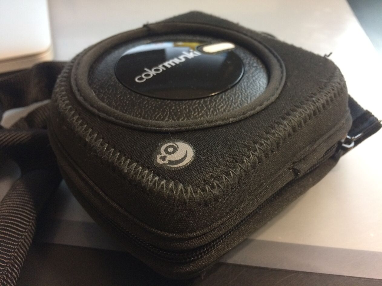
Calibration devices used to be extremely expensive, but in recent years they have gone down in price. I have a ColorMunki Photo which does display, printer, and camera calibration. It also has a useful feature of being able to photograph color swatches, telling you exactly what color something is. You hang it over the top of the display on a specified spot on the screen, and it accurately photographs the colors, producing a color profile at the end that accurately reflects the actual color coming out of the screen.
Color calibration is something I see many professional designers ignoring. No designer or artist should use a non-calibrated display for their work. It’s important to calibrate the display somewhat frequently, at least a few times a year. Environmental factors and slight changes in color output in the display can change over time.
What’s above is a lot to take in, but this should conclude the preliminary writings on color I wanted to do before jumping into color theory itself. It’s important to understand truly what color is and how it’s applied before discussing theories around using it in our work.