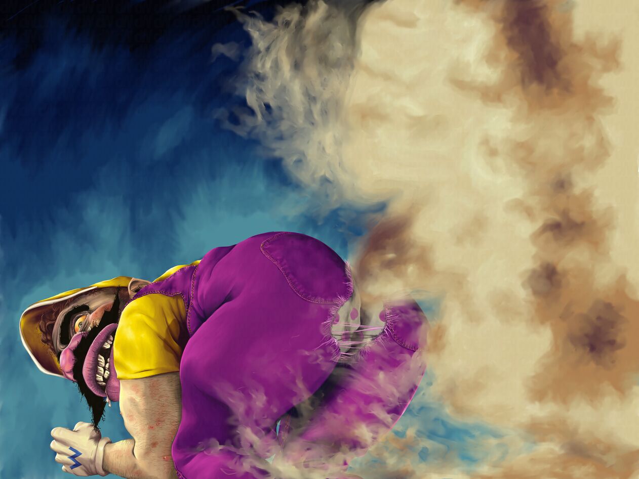
Blown Away

NOTICE: This page references both My Opera and N+ which no longer exist.
I finally finished this about two days ago. It’s an illustration of a filthy-looking Wario’s letting out a huge fart. It’s crude and repulsive, but I like it nonetheless. I decided to do this like a Bill Wray image, especially those illustrations he did for Ren & Stimpy. I tried my best to make him as horrible as possible, and I think I did that. I didn’t do the illustration because I hate Wario. On the contrary, he’s one of my favorite characters. It was created using Adobe Illustrator for the drawing and Corel Painter X for the painting part with Photoshop serving as a compositor. The image is quite large, being at 12,000×9,000 pixels. I really enjoy working at that size because a simple paint dab could serve as a lot of detail when resized smaller. It makes things a whole lot easier in my opinion.
This illustration was accompanied by a new layout for N+. On My Opera users are given a stylesheet to do whatever they please, so while limited by what can be changed to the markup an author is completely free to do what he/she wants to the CSS N+ is a group on My Opera that’s dedicated to providing a community for Nintendo gamers accompanied with news and contests. I’ve been a member for some time now and I’ve been a moderator for almost as much time. The design I’ve created was done to properly separate the sidebar from the main content while still keeping both in near equal focus as there are important things on both columns to many readers. I also decided to shrink the website’s content area to make way for giving the sidebar a bit of breathing space. It’s easier to read and easier to understand with an obvious separation in appearance from the content and the sidebar and a separation between the content in the sidebar from one another. I’m really pleased with it, although I still do have some things to fix. If given a chance, go visit N+ and by all means join if it is to your liking.